NC Election Results Maps
Me
Overview
In the summer months of 2026, I was a student in the Lede Program at Columbia University. In class, one of our instructors shared a piece she did while she was working for the L.A. Times. It was an interactive map of how Los Angeles voted for their Mayor. It was a choropleth map that beautifully represented how each precinct in the city voted through gradients of colors. The map's interactivity allowed users to hover over precincts, click to reveal details, and search to find their own precinct by address.
I felt inspired. And then I thought, naturally, I wonder if I could do the same thing for where I live? To my knowledge, at least, I couldn't recall or find any digital news websites around Raleigh, NC that published maps like these for election results.
And thus the journey began. Our protagonist stepped forward into the foreign lands of State Board of Elections. There, he was promised tallies for every candidate in every race in every precinct in every county in North Carolina. He was also given a bundle of geo-spatial polygons to go along with it. He didn't understand what any of this meant at the time, but he feared not. He brought along his trusted side-kick, a two-headed slithering reptile named, Python.
Their journey took them to Jupyter where they got lost in Notebooks many, many times. For their cartography, they revisited old friends, the three wise sages of HTML, CSS, and JavaScript. And along the way they met a new friend, kind of a strange, intelligent, and hyperactive alien named Claude.
Techs
python

jupyter notebook

geoJSON

mapbox

javascript

chatgpt

claude

Check It Out
Scope
NC State Board of Elections provided all the data for this project. They are an independent entity in charge of administrating elections and tabulating results as well as upholding campaign finance disclosures and compliance.
They provide historical results data for every election in plain text format going all the way back to the year 2000.
For this project, the scope started with the most recent election, which at the time of publishing was NC's Primary Election on March 3, 2026.
Then, of course, things got more complicated (most of which were self-inflicted).
The inspiration for this project, as mentioned above, was an article in the LA Times that analyzed their mayoral race back in June, 2026.
I, being a former software engineer, looked at the data available to me and said, to myself, "Why make just one map for one race? When I can make ALL THE MAPS FOR ALL RACES."
Smh.
Well, here we are, an election-agnostic data pipeline that takes NC's election results data, filters it, cleans it, and merges it with NC's precinct-geometry data (also provided by NCSBE) for every contest in that election cycle. The resulting dataframes are exported as geojson files for the web.
Complexities
Precinct IDs
To make a map display election results at the precinct-level, I needed to merge two data sets -- results with geography. I had data what happened for each contest for each candidate in each precinct and I had data for where those precincts are located. And thankfully, each data set came with a precinct ID. All I had to was merge the results to the geography, right?
Wrong. Well, theoretically, yes. However, because I chose to make this more complicated (SMH), when I ran into two issues: uniqueness and matching. The uniqueness issue was easy to solve. Some counties in NC have the same precinct IDs. For example, Durham County Precinct 01 and Wake County Precinct 01. Solution: create a merge key combining county name and precinct ID. Matching, on the other hand, was more of a head-scratcher.
Election results per precinct and precinct geography were two separate data sets. In order to merge the two together on county name & precinct ID, both sets needed to having matching county names (check) and precinct IDs (nope).
I discovered that on the election results data, for example, Durham County's precinct was "01". Well, on the geography data set, Durham County's precinct was just "1". Both were data types were strings and on a merge, that ain't gonna match. I checked Durham because I work in Durham. NC has 100 counties... how many more mismatches existed? My heart sank.
This was the moment I consulted ChatGPT. Together we created a precinct-crosswalk. A deep analysis of every precinct ID for every county on both data sets so that we could isolate all the mismatches and then, fix them properly.
After running the crosswalk, the mismatching precinct ID issue was less severe than I assumed (the unknown can be scary). NC has 2633 unique county name & precinct ID combinations. We categorized the mismatching issues and these were the results.
| Match method | Precincts |
|---|---|
exact | 2,223 |
leading_zero | 398 |
decimal_leading_zero | 11 |
no_geometry | 1 |
| Total | 2,633 |
leading_zero issues were like the Durham County 1 & 01 issue I described above. We have a similar but different issue with precincts that had decimal points. For example, 78.1 & 078.1. Had to handle those with a separate regex.
And then there was one strange precinct that did not have any geometry in the data set, Henderson County precinct CV. We added a one-off record with notes for it in the crosswalk CSV. Oddly, this precinct has votes for several contests in the election results data set. However, without geometry data, it can't be displayed on a map. On my to-do list I have a task to call NCSBE and ask them about it.
UX Design
For making the web maps, I used Mapbox (just because the LA Times used it. Also, Mapbox has customization capabilities that other platforms don't which came in handy.).
Designing the map was both more complicated than I expected and also, enjoyable. I always enjoy the immediate gratification of seeing a colorful front-end come together. However, there were many micro-decisions that had major impact on the impending user's experience.
Most user interactions were straight-forward and made sense to copy from the LA Times: on-hovers, on-clicks, reducing noise, etc.
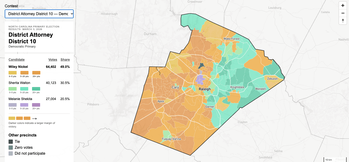
The three-colored swatches that the LA Times used for each candidate also created a lovely mosaic effect for their choropleth map.
However, they displayed two types of color changes for each candidate where I only did one. They displayed a darker color for the candidate wherever the margin of victory was larger, which I chose to do as well. Their second color change, which I opted out of, was for the color's opacity, meaning the color being more or less transparent.
The color's opacity, according to their map's legend, represents voter density (for each precinct). I spoke to the LA Times reporter and learned that the opacity was calculated by total votes over the precinct's area. This meant calculating the actual, physical area of each precinct using a measurement unit like square feet or square miles. Then, taking total votes and dividing it by that area to create a sense of vote density in the precinct.
NCSBE had data available for each precinct in square feet however, I was stuck on the definition of "voter density". I wasn't sold on whether this calculation accurately represented it or not. NC has many rural areas. What if a precinct has a large area with a small amount of people living there? Would that color's opacity skew the user's perception of this precinct? Not having an editor to discuss it with, I decided to leave it out altogether.
Winners, Losers, and Others?
Election contests were categorized into groups depending on who was able to vote in it. The categories were: state-wide, districts, county-wide, county districts.
Not included were pipelines for multi-vote county district races and referendas. I still plan to add these. I just wanted to finish the most common races first.
There were many races that had precincts where zero votes were casted, a tie (greater than zero votes), or precincts that did not participate in the race but were still displayed on the map (county district races).
Each of those had to be identified and handled. I chose to do it on the javascript side so that the python analysis could just be simply cleaning, filtering, and merging. My thinking was that, ultimately, a tie, zero-vote, or non-participation precinct result was a display decision (how should be colored, text weight, et al.) so therefore the display logic should handle it.
Speed and Performance
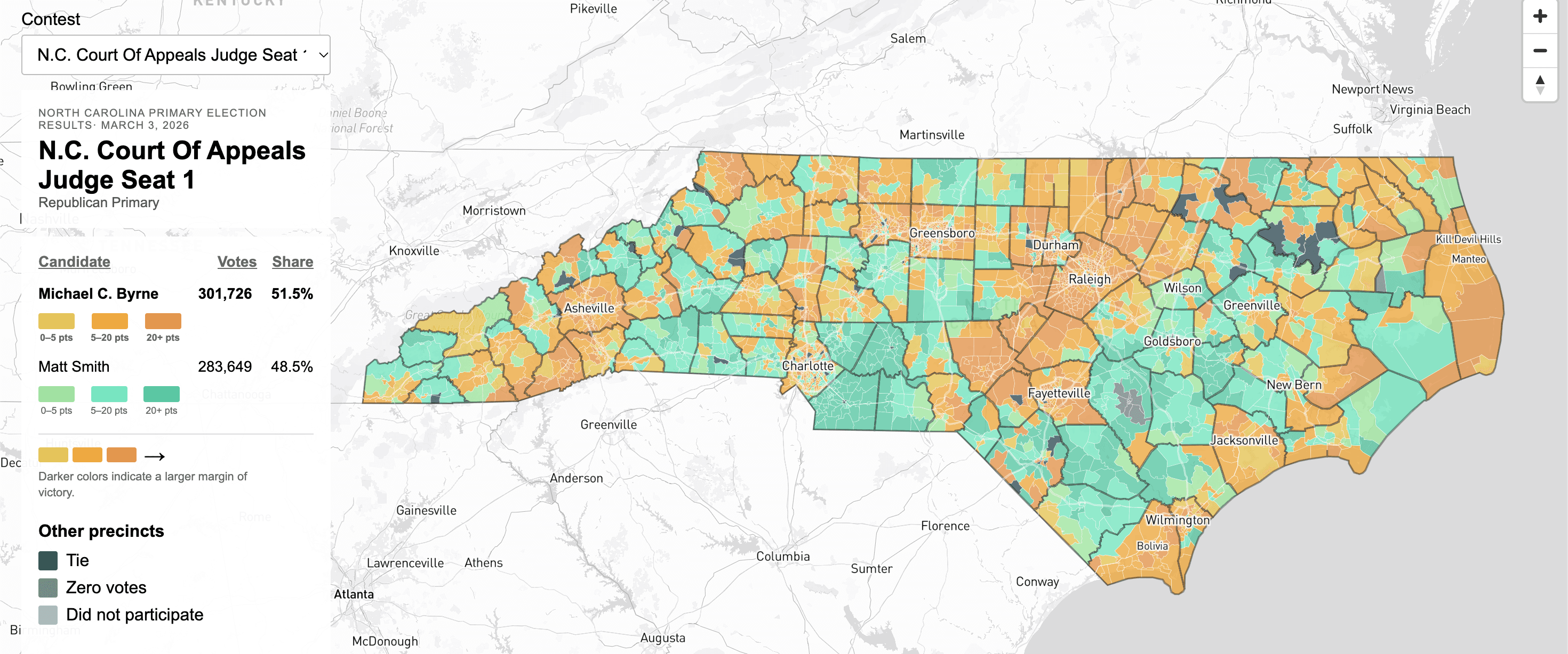
Being that I chose to make ALL MAPS FOR ALL RACES (smh), I ran into some performance issues. There were a total of 472 maps, each with two GeoJSON files for web display. The main concern was the size of the files for the state-wide contests. NC's Primary Election on March 3, 2026 had 4 state-wide contests, meaning all 100 counties and all 2633 precincts participated and needed results and geometric polygons for everything. That's the main image above. It was a lot of data. And the sizes of these files in particular were large. Not too large to hit the Github limit but large enough that we had to wait a couple seconds for each map to load.
The idea was to give the user all of the maps so that they could look at whatever they wanted. Having worked in software engineering before, a couple seconds on each load for a U.I. ain't gonna cut it.
I ended up changing a setting on Mapbox to slightly reduce the precision for each GeoJSON file. This change only affected how precise precinct border lines and county border lines were drawn at a minute level. None of the contest results were touched and the file sizes reduced drastically.
Final Thoughts
Although I made it sound like it was regrettable to have made the scope MAPS FOR ALL RACES, it was worth it. Honestly, the extra bit of set up wasn't too much of a headache. And once it was ready, all 472 maps were created in ~5 seconds (!!).
If this were an assignment to analyze one race or a handful of races, things would definitely get simplified in order to meet the purpose of the story and hit the deadline.
That being said, I learned so much about how we handle elections by doing this work for two weeks (don't even get me started on precinct-sort data. Read about that in the methodology.). I had to drop perfectionism and accept "good enough", while still upholding accuracy.
These pipelines are indeed election-agnostic as long as it has the latest precinct geometry shapefiles.
To brighter days for all.